One of my first projects at RocketDocs involved re-skinning our form-driven, document generation tool currently known as Response. Prior to the redesign, I conducted a thorough analysis of tools in a similar space or with similar intent (e.g., other form builders). Additionally, I interviewed a handful of customers using the current version of the tool to gain a better understanding of their individual use cases and pain points. The redesign aimed to not only improve the Response user experience but also provide a design foundation on which to model the larger, re-envisioned platform.
I first created a series of high-fidelity wireframes, then added color and interactivity through InVision. Feedback from team members and customers shaped further adjustments. Ultimately, I collaborated with the development team to bring our vision to life.
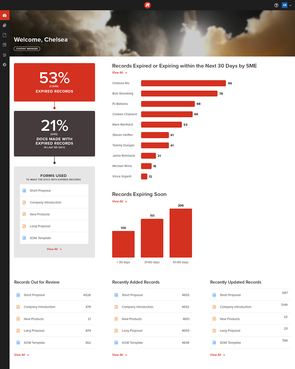
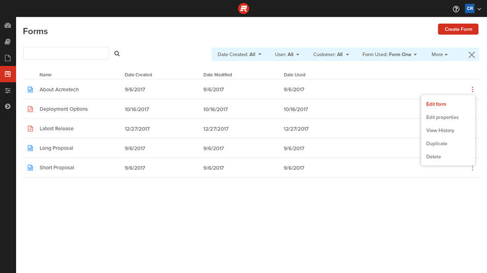
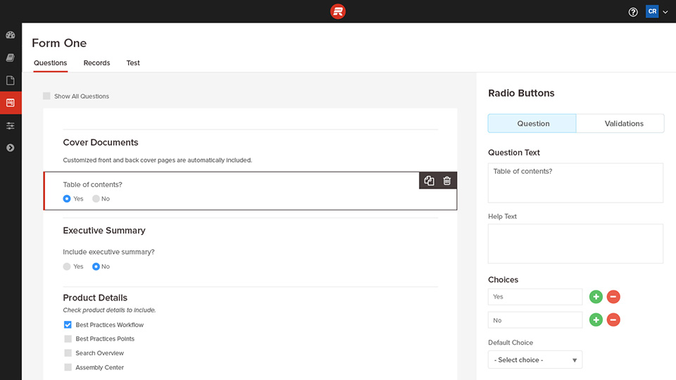
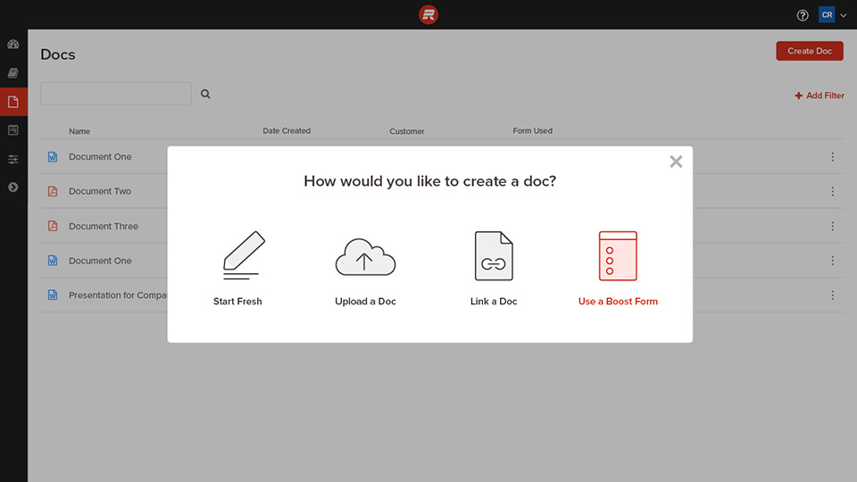
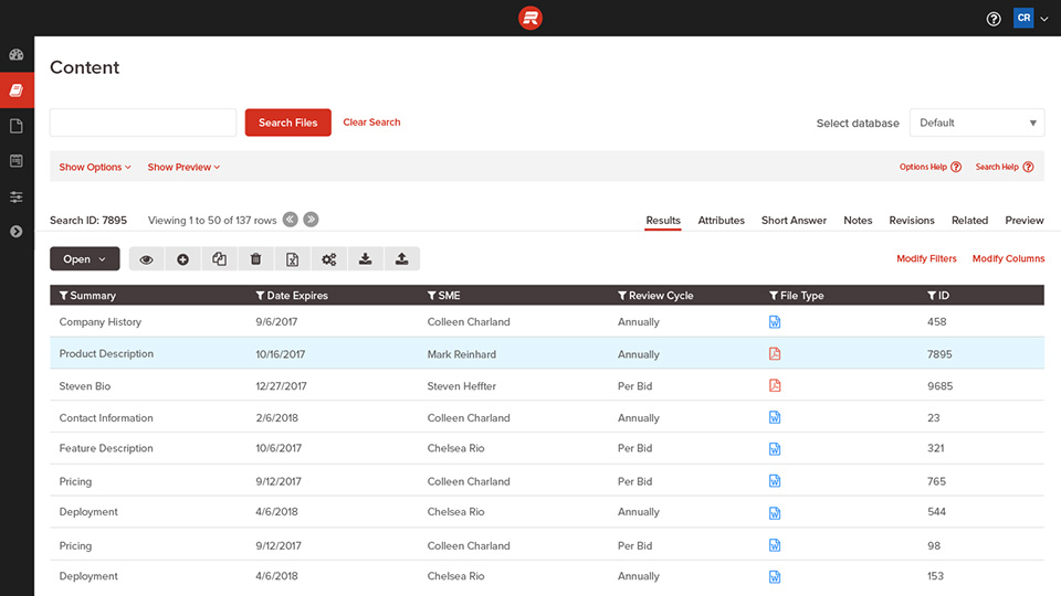
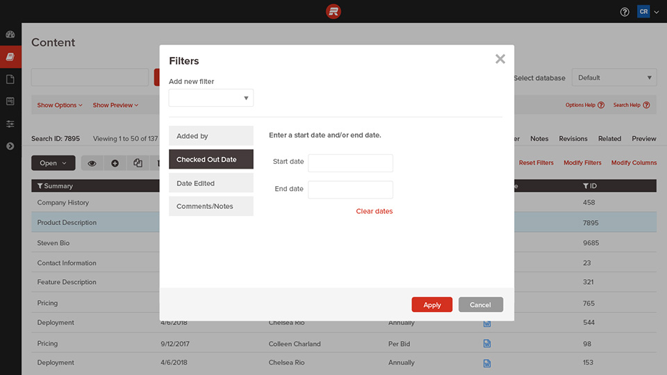
Response now features an intuitive, drag and drop form builder and associated storyboard. Additionally, the slick dashboard provides a number of actionable stats related to content hygiene. Overall, the tool feels tremendously more modern — for those who build the forms as well as those who complete them.