This client initially approached me requesting revisions to their web presence. At the time, they were using two different logos to suit various use cases. I suggested rebranding as the first order of business. Only then could we move forward with a solid, unified identity.
Blue Sources provides 24/7 water quality monitoring using live fish. Their patented technology, known as BG-n, monitors fish breathing patterns, raising the alarm when anomalies occur.
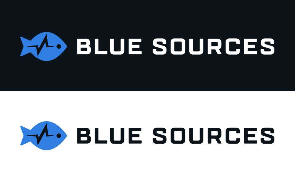
After exploring several directions, we settled on the logo below. The pictogram combines iconography for the fish and signal, positioning the fish as the signal origin and water quality expert. I paired this mark with TT Lakes Bold, a clean, modern font suggesting the sophisticated technology and underlying simplicity of Blue Sources.
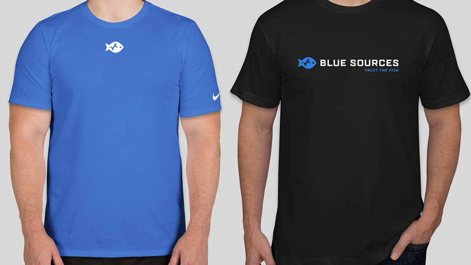
The logo holds up well at a variety of sizes and can be optionally paired with their tagline. Additionally, the logo can assume a stacked configuration that may be preferable for centered designs or those with limited horizontal real estate.
For the palette, I selected “Brilliant Cobalt Blue” (a vibrant hue that clearly does justice to the company’s name), a deep black-blue, and vivid accent colors.