When I began working at RocketDocs (formally known as Proposal Software), one of my first tasks consisted of producing a brand identity for the soon-to-be renamed company. As I quickly learned, RocketDocs would push beyond proposal automation, tackling generalized document automation as well as enterprise content management, content sharing, and content enablement. Altogether, this platform would serve a wider breadth of B2B customer-facing teams, empowering them to turn their information chaos into usable content.
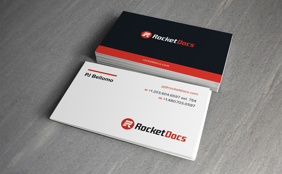
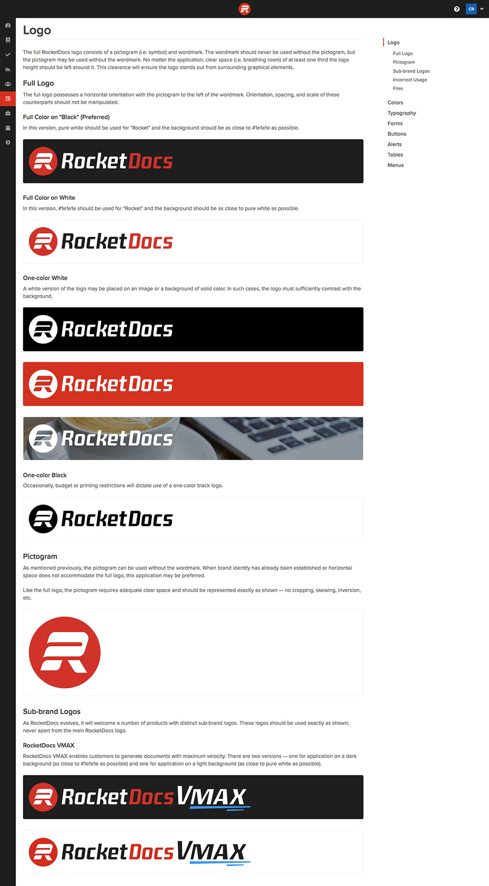
The new identity needed to reflect the speed, simplicity, and technological sophistication of the new platform while remaining trustworthy and approachable. After several rounds of concepts, we settled on the pictogram and wordmark combination below. The pictogram suggests an “R” and “D” as well as the momentum of a rocket, without taking the theme too literally. Nominal strokes and consistent curves enable the mark to remain recognizable at even the smallest of proportions. The wordmark, Sagan Semi Bold Italic, not only pairs nicely with the pictogram but underscores the perfect balance of strength and warmth.
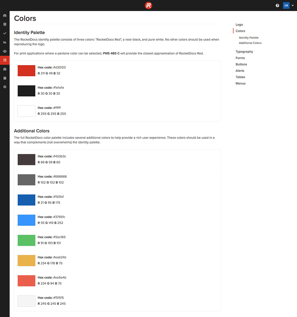
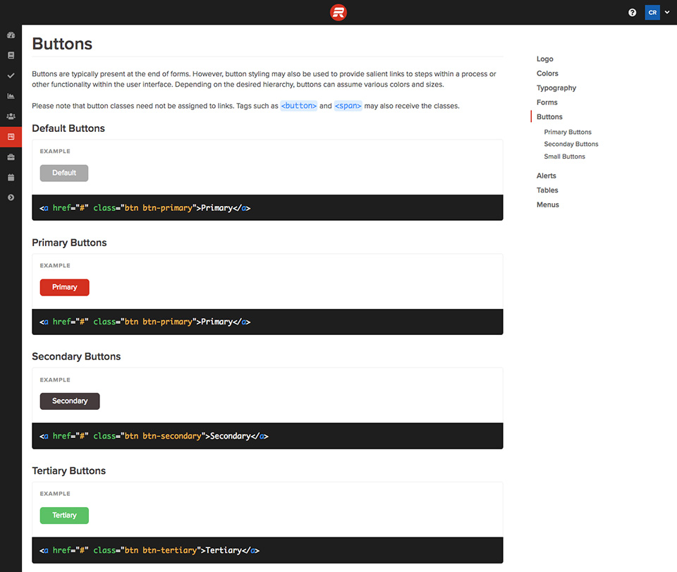
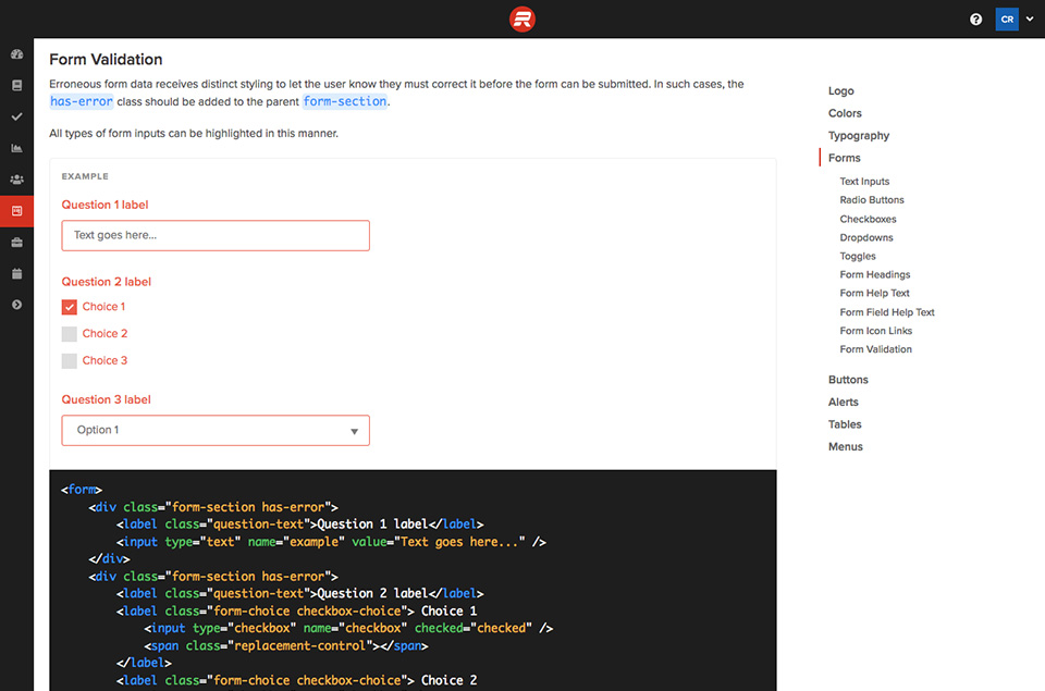
To accompany the new identity, I drafted a comprehensive microsite detailing our brand guidelines and UI patterns. These specify our logo usage, color palette, and fonts as well as precise markup instructions for our developers.

