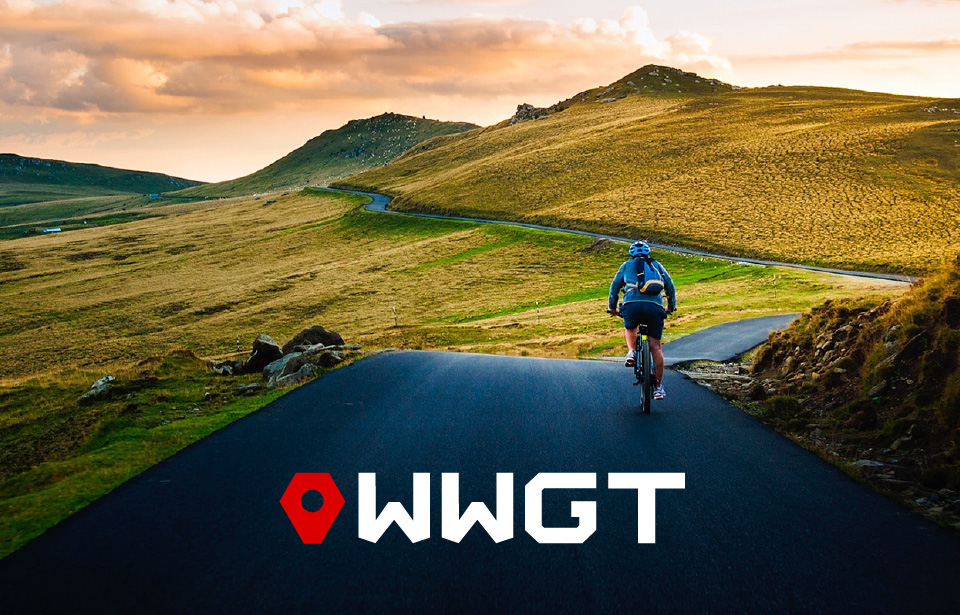
This client requested a logo for their cycling lifestyle brand, WWGT, an acronym for We Will Get There. The mark needed to be bold, resolute, and decipherable at the scale of a bicycle sticker. The client also preferred a pictogram which could be leveraged separately from the wordmark.
For the pictogram, I created a mark the client has dubbed the “pin-bolt”. This symbol merges iconography for a map pin, connoting the brand’s focus on destinations, achievements and goals, with that of a hexagonal bolt, which speaks to the client’s technical proclivity. I paired the pin-bolt with a thick, angular font by the name of Rally Regular.
For the main version of the logo, the pin-bolt is a robust red and the wordmark white or charcoal. I produced alternate versions of the logo to reflect the color schemes of each of the client’s bicycles. Despite the playful treatment, the logo remains steadfastly recognizable.